

Quickly make cool stock price data visualizations
Representing data visually is incredibly useful for learning how it behaves.
This is especially true with financial market data.
A word of caution however:
Humans are incredibly good at seeing only evidence that confirms our beliefs and visual data lends itself well to that.
We can use visualizations during our hypothesis formation phase, but should not be used to test a hypothesis.
By reading today’s newsletter, you’ll get code to generate the most common types of plots in a few lines of Python.
Let’s go!
Quickly make cool stock price data visualizations.
Visualizing financial markets transforms data into understandable visuals using Matplotlib.
Matplotlib is ideal for creating high-quality financial visualizations. These are important for investors and analysts.
Matplotlib integrates smoothly with Pandas providing a toolkit for data visualization. This integration helps visualize data quickly to uncover trends and patterns.
Professionals use Matplotlib to detect market trends, compare stock performances, and make informed trading decisions.
The best part is Matplotlib is simple to use.
Let's see how it works.
Imports and set up
Start by importing Matplotlib and yFinance and downloading stock price data.
This code downloads historical stock data for Apple and Microsoft using Yahoo Finance. The data is retrieved for a specified period from January 1, 2020, to December 31, 2024. We focus on the adjusted closing prices, which reflect any corporate actions such as dividends or splits, providing a more accurate representation of a stock's value.
Visualize the frequency distribution of stock prices and returns
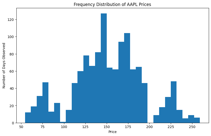
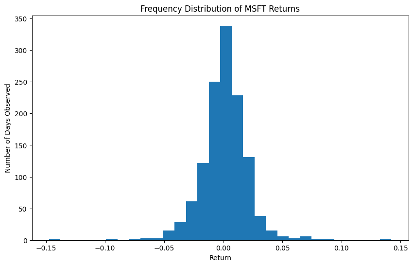
We'll plot histograms for Apple's stock prices and Microsoft's daily returns. This helps us understand the distribution and volatility of the stock prices and returns over the period.
The result is a histogram of prices.

In finance rarely will we look at the distribution of prices. The reason for this is that prices are non-stationary and move around a lot. Instead we will use daily returns. Let's try that now.
Now we have a histogram of returns.

This section first plots a histogram of Apple's daily adjusted closing prices using 30 bins. This visualization allows us to see how often certain price levels occurred over the examined period. The second part calculates Microsoft's daily returns, excluding the first day since a percentage change cannot be calculated from a nonexistent previous day.
The histogram of returns helps visualize the volatility and frequency of different return levels.
Analyze the cumulative distribution of stock returns
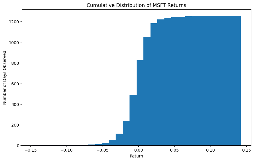
We'll create a cumulative distribution plot for Microsoft's daily returns. This will provide a visual representation of the probability that the returns will fall below a certain level.
The result is a cumulative distribution of returns.

This code generates a cumulative distribution plot for Microsoft's daily returns. By setting the cumulative parameter to True, the histogram shows the cumulative frequency of returns, essentially the probability that a randomly chosen return is less than or equal to a specific value.
The cumulative distribution gives insight into the return behavior, showing how returns accumulate over time and the likelihood of various return levels. This is particularly useful for assessing risk and understanding long-term trends.
Explore relationships between returns
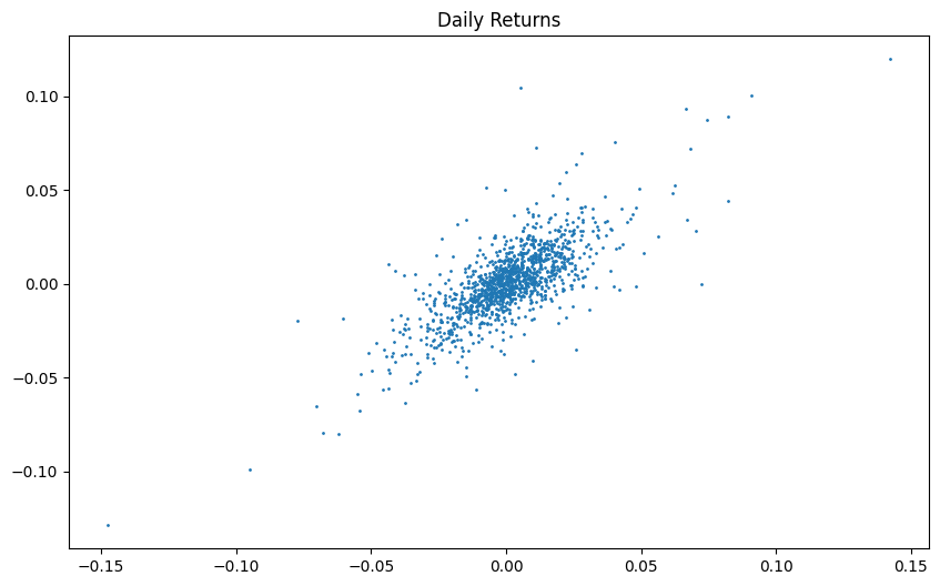
We'll create scatter plots to visualize relationships between daily returns for Microsoft and Apple. This helps us assess if any correlation exists between the two companies or between consecutive days.
We can see a positive linear relationship in the resulting plot.

By examining this plot, we can explore whether the movement in Microsoft's prices or returns influences Apple's, or vice versa, and assess the strength of these relationships.
Your next steps
Try altering parts of this code to further your understanding. You could explore different stocks or adjust the date range to see how market conditions affect results. Experimenting with different visualization techniques can also provide new insights into stock behavior.


