


Technical analysis with Python: 3 indicators you can learn in 2.5 minutes
When I first started trading, I sat next to Eddie.
Eddie was on his second career. During his first, he had a few bad trades and blew up his trading account. He took some time off and started again.
Instead of relying on his instincts like the first time, he used technical analysis to get an edge.
I watched as he put levels into his spreadsheet, drew lines on the chart, and religiously bought at sold when the charts told him to.
Eddie always seemed to make money.
“Hey Eddie, what are those levels you always trade?” I asked one day.
He gave me his secret:
“Ah, it’s where all the traders think something’s going to happen.”
Then he walked away.
“Useless I thought.”
Only now do I realize what he was talking about.
Lines on charts are self-fulfilling prophecies and important to understand.
All traders see the same thing and often trade the same way.
This is what Eddie understood that most traders do not.
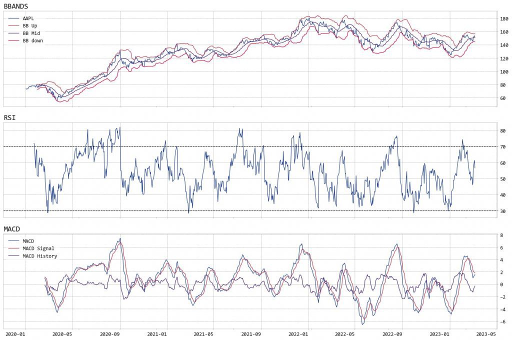
Today, you will use the popular TA-Lib technical analysis library to plot Bollinger Bands, RSI, and MACD using Python.
Traders use Bollinger Bands to identify potential trading opportunities in the financial markets.
They're usually used for identifying overbought and oversold conditions.
People also use them for measuring volatility and getting ahead of trend reversals.
Traders use the Relative Strength Index (RSI) to identify overbought or oversold conditions.
RSI oscillates between 0 and 100. Values above 70 show overbought conditions and values below 30 show oversold conditions.
The Moving Average Convergence Divergence (MACD) is a popular technical analysis tool, too. It's used by traders to identify trend reversals, momentum shifts, and trend strength.
MACD is based on the difference between two exponential moving averages with different periods.
Import and setup
Start by importing Matplotlib for plotting and pandas for data manipulation.
Then import TA-Lib and the OpenBB SDK.
Use OpenBB to grab some stock data.
TA-Lib has more than 150 indicators and is one of the most popular libraries around. Using it is simple with Python.
Depending on the indicator, the function takes different values. BBANDS takes the closing price, the lookback window, and the number of standard deviations. RSI just takes the lookback window, and MACD takes the fast, slow, and signal periods.
Plot the indicators
Use pandas to put all the data together and Matplotlib to plot it. First the data.
Create two DataFrames: the first for the MACD signals, the second for the remaining indicators.
Then plot them.
You created tree charts, all aligned by date. The top shows the Bollinger Bands, the middle one RSI, and the bottom the MACD.
Since all traders see the same charts, you can use technical analysis to find out what other traders are doing.
Used with time series and other quantitative technicals, technical analysis can be used to filter out the noise from messy data.